Development, Technologies 24.08.2026
24.08.2026 SpeedyGo: One plugin to make your WordPress website faster
 Corvexa: AI that turn more website visitors into qualified leads.

 Energy
 Oil and gas
 Transportation
 E-commerce
 Healthcare
 Real Estate
 Fintech
 Manufacturing
 Education
 Agriculture
 Travel
 Cyber Security
 Crypto
 Law and Order
 Entertainment
 Hospitality
 Logistics
 Non-profit
 Digital Industry
 Venture Capital
A Quick Guide on the Right Software Development Approach for Enterprises in 2023

 24/08/2026


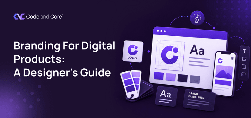
In this guide, we’ll look at what digital product branding actually means, how designers turn a brand identity into a usable interface, why consistency matters, how branding affects trust and recognition, what to include in a digital brand system, and how to make branding work across custom web solutions without making the product feel over-designed.
The goal is not to make every screen look “on-brand.” The goal is to create a product that feels recognisably yours while remaining easy to use.

Traditional branding often focuses on things like:
Digital product branding takes those foundations and brings them into an interactive environment.
Your brand appears through:
This means your product is not simply displaying the brand. The product is delivering the brand experience.

Imagine two software products.
Product A
The website looks premium.
But once you log in:
Product B
The marketing website and product feel connected.
The same visual language continues through:
Which company feels more trustworthy? Probably Product B.
Why? Because consistency creates familiarity.
And familiarity reduces the mental effort required to understand a product.

This is one of the biggest misconceptions in digital design. Branding is sometimes treated as something added after UX is complete.
Like: UX → UI → “Now let’s add the branding.”
But strong digital products usually work differently. Brand thinking should influence the experience from the beginning.
For example:
A financial product may need to feel: Clear + Secure + Reliable
A creative collaboration platform may want: Energetic + Friendly + Flexible
An enterprise analytics platform may need: Professional + Precise + Intelligent
Those qualities can influence everything from typography to interaction patterns.

Before choosing colours, define how the brand should feel.
Ask: If this product were a person, how would it communicate?
Would it be:

A brand does not exist in isolation. It exists in the mind of the audience.
A product for teenagers should not necessarily communicate like enterprise accounting software.
A healthcare platform may need a different emotional tone from a gaming application.
A B2B SaaS product may need to balance professionalism with approachability.
Ask:
Good branding meets users where they are.

Once the brand personality is clear, designers can translate it into a visual system. This usually includes:

A brand colour needs to work in real interfaces. Imagine choosing a beautiful bright green as your primary colour.
It looks great in the logo. Then you use it for:
Suddenly you have a problem. The same colour cannot necessarily perform every job. A digital product may need a broader colour system:
Brand colours
↓
Primary
Secondary
Accent
↓
UI colours
Success
Warning
Error
Info
↓
Neutral colours
Background
Surface
Border
Text
This gives designers flexibility without losing brand consistency.

Typography does more than make text readable. It creates personality.
Compare: A geometric sans-serif with A traditional serif with A handwritten display font
They communicate different feelings. But there is an important rule:
Brand personality should never come at the expense of readability.
A beautiful typeface that is difficult to read is not good digital branding.
Especially when users need to:
Digital typography needs to work at different sizes and on different devices.

Instead of choosing fonts randomly for each screen, establish rules.
For example:
H1: Main page heading
H2: Section heading
H3: Subsection
Body Main: content
Caption: Supporting information
Button: Action text
This creates consistency. Users begin to understand what different text styles mean. And designers can work faster because they are not reinventing typography for every page.

This is where branding becomes practical. A design system turns your brand identity into reusable UI components. For example:
Instead of designing each component from scratch, teams work from shared rules. This is particularly valuable when building custom web solutions that need to scale over time.

Animation is another opportunity. A product can develop a recognisable motion language through:
But motion should have a purpose.
For example:
A subtle transition can communicate: “Your action worked.”
A loading animation can communicate: “We’re processing your request.”
A playful interaction can reinforce: “This product is friendly.”
The key is restraint. If everything moves, nothing feels meaningful.

This is one of the easiest things to overlook. Imagine your app has an error.
Version A Error 403. Invalid request.
Version B Something went wrong. Please check your details and try again.
The second feels more human.
Now imagine a productivity app saying: “Nice work, your project is ready.”
That sentence communicates personality.
Another enterprise product might say: “Project successfully created.” Neither is automatically better.
The right choice depends on the brand. Your interface speaks even when nobody from your company is there.

There is a line between distinctive and difficult.
For example:
The product may look unique. But users may struggle to use it.
Let branding influence the experience without fighting it.
Brand personality should support usability, not compete with it.

Create simple writing rules.
For example:
We are
We are not
Then apply those rules to:
This creates a consistent personality

Before launching your product, review:

A logo matters, but your brand is bigger than your logo. Start with strategy and user experience.
Too many colours create inconsistency. Define clear roles for your colours.
Choose fonts for readability and usability, not just appearance.
Your website and product should sound like the same brand. Keep the voice consistent.
Reusable components help maintain consistency as your product grows.
Learn from competitors, but build an identity that is uniquely yours.
Your brand also shows up in errors, loading states, missing data, and failed payments. Design those moments too.

A practical process could look like this:
What makes the product different?
How should the product feel?
What will they expect and trust?
Define:
Turn those foundations into buttons, forms, cards and other reusable elements.
Create rules for product copy.
Test the system across actual workflows.
Create guidelines so future designers and developers can maintain consistency.

Think about the products you use every day. You may recognise them before reading the company name.
Why? Because the product has built a consistent visual and behavioural language.
That recognition comes from repetition. Not necessarily repetition of the logo. It comes from repeating:
Colours + Typography + Components + Tone + Interaction patterns
Over time, those details become associated with the product.
People are more comfortable with experiences that feel coherent. Imagine a company website that looks polished, but its customer portal feels unfinished.
That creates a gap. Users may start wondering:
“Is this company actually reliable?” The reverse is also true.
A consistent digital experience can reinforce the perception that the business is organised and intentional. Branding does not create trust on its own. But inconsistency can certainly weaken it.
Not every business needs a completely custom digital product. Sometimes a standard platform is enough.
But custom development becomes useful when your business needs:
In those cases, branding and product design should be considered alongside development from the beginning. The technology should support the experience you want to create.

How Code and Core approaches digital product design
At Code and Core, branding is considered alongside UX/UI design and development rather than treated as a separate layer that is added at the end.
The team works across UX/UI design, web development, custom software and mobile development, allowing brand decisions to be translated into actual digital experiences.
For businesses building custom web solutions, this connection is particularly important.
The final product needs to look like your brand, but it also needs to:
Work well → Communicate clearly → Scale properly → Remain consistent
That means thinking beyond the homepage.
The brand should continue into the dashboard, forms, interactions, mobile experience, notifications and every other place customers interact with the product.
A digital brand isn’t just something users see. It’s something they experience. Every interaction from onboarding and buttons to errors, emails, support, and dashboards—shapes how users perceive your brand.
That’s why strong digital product branding brings together: Strategy + UX + UI + Content + Technology
When these elements work together, your product feels consistent, memorable, and easy to use.
Code and Core can help you combine branding, UX/UI design, and development to create digital products and custom web solutions built around your users and business goals.
Your brand deserves to be experienced, not just displayed.

It helps create a consistent and recognisable experience. Strong branding can improve familiarity, strengthen credibility, and help users feel more comfortable using a digital product.
Key elements include logo usage, colours, typography, imagery, iconography, UI components, design systems, micro-interactions, content, and brand voice.
Branding influences how a product looks, feels, and communicates. When applied correctly, it supports usability while making the interface more distinctive and memorable.
A digital brand system is a set of guidelines and reusable design elements that define how a brand should appear and communicate across digital experiences. It can include colours, typography, components, spacing, imagery, icons, and content guidelines.
Design systems provide reusable components and consistent rules for elements such as buttons, forms, cards, navigation, and typography. This helps maintain brand consistency as a product grows.
Yes. A consistent and professional digital experience can reinforce a company’s credibility. However, branding alone does not create trust; usability, reliability, security, and overall product quality also matter.
Custom web solutions allow businesses to create unique workflows, interfaces, integrations, and customer journeys that align closely with their brand identity and business requirements.
Common mistakes include using too many colours, choosing fonts only for appearance, ignoring product copy, copying competitors, overusing branding elements, and failing to design consistent error, loading, and empty states.
Branding should be considered from the beginning of the product design and development process. This allows brand strategy, UX, UI, content, and technology to work together rather than adding branding at the end.
Catch wind of the latest technologies, strategies, and information that are set to boost your business operation. We update frequently!
 23.06.2026