UI/UX 20.08.2026
20.08.2026

 Energy
 Oil and gas
 Transportation
 E-commerce
 Healthcare
 Real Estate
 Fintech
 Manufacturing
 Education
 Agriculture
 Travel
 Cyber Security
 Crypto
 Law and Order
 Entertainment
 Hospitality
 Logistics
 Non-profit
 Digital Industry
 Venture Capital
A Quick Guide on the Right Software Development Approach for Enterprises in 2023

 20/08/2026


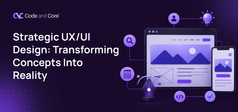
In this guide, we’ll walk through how an idea becomes a real digital experience, what UX and UI actually contribute, how designers decide what goes on a page, why research matters before visual design, what the design-to-development process looks like, and how to choose the right team when looking for custom web design services.
You have an idea for a website.
Maybe it is a completely new business, and you are starting from scratch. Maybe your existing website looks outdated, feels difficult to use, or simply does not represent the quality of your business anymore. Or perhaps you already have a clear product idea in your head, but you are not sure how to turn that idea into something people can actually use.
That is where strategic UX/UI design comes in.
| The simple idea: Good design is not about making a website look impressive. It is about making the right things easy for the right people. |

UX and UI are often mentioned together, so it is easy to assume they mean the same thing. They do not.
UX, or user experience, is about how the experience works.
It asks questions such as:
UI, or user interface, is about how that experience is presented.
It covers things such as:
Think of it this way:
UX decides the journey.
UI designs what that journey looks and feels like.You need both.

This is one of the biggest differences between simply designing a website and strategically designing one.
When someone says: “We need a homepage, about page, services page and contact page.”
That is a list of pages. It is not yet a user experience.
The more useful question is: “What does a visitor need to understand, believe, and do before they become a customer?”
That changes the entire design process.
For example, imagine a visitor arrives on a B2B software website.
They may need to understand:
What is this? → Is it relevant to me? → How does it work? → Can I trust it? → What does it cost? → What should I do next?
A strategically designed website makes that journey feel natural.
A poorly planned one makes the visitor hunt for answers.
And that difference matters.
Baymard Institute’s research across thousands of ecommerce U0X elements consistently shows that usability problems can directly contribute to abandonment and lost conversions. Its latest research also shows that many leading ecommerce sites still have significant room for improvement in areas such as navigation, product pages, and checkout.
Design question worth asking:
If a first-time visitor landed on your website right now, could they explain what you do within a few seconds?If the answer is no, the problem may not be your marketing.
It may start with the experience itself.

Before designing anything, you need to understand why the website is being built in the first place.
Is the goal to:
The answer affects the design.
A lead-generation website should make it easy for visitors to understand the offer and take the next step.
An ecommerce website needs strong product discovery, comparison and checkout experiences.
A SaaS application may need completely different flows around onboarding, dashboards and account management.
So the first deliverable should not necessarily be a visual design. Sometimes it should simply be clarity. A useful discovery checklist
Before the first screen is designed, ask:
| Question | Why it matters |
| Who are the users? | Determines what they need to see |
| What problem are they solving? | Shapes the user journey |
| What is the business goal? | Determines key conversions |
| What action matters most? | Helps establish hierarchy |
| What existing data do we have? | Prevents designing based on assumptions |
| What competitors do users already know? | Helps identify expectations |
| What technical limitations exist? | Keeps the design realistic |

You are not designing for “everyone.” You are designing for specific people with specific expectations.
A first-time visitor may need education.
A returning customer may want speed.
A technical buyer may want specifications.
A business owner may immediately look for pricing and ROI.
A designer who understands these differences can create a much more useful experience.
Think about user intent
Instead of simply asking: “What should this page contain?”
Ask: “What is the person coming here to accomplish?”
That one question can completely change a page.
For example:
Visitor intent: “I want to know whether this company can build my website.”
The page may need:
- Relevant services
- Portfolio examples
- Industries served
- Development capabilities
- Client proof
- Process
- Clear CTA
The goal is not to fill the page with information.
The goal is to provide the right information in the right order.

Now we start deciding how information should be organised.
Think of information architecture as the website’s underlying structure.
WEBSITE
│
┌───────────────────┼───────────────────┐
↓ ↓ ↓
About Services Work
│ │ │
Company ┌───────┼───────┐ Cases
↓ ↓ ↓
UX/UI Web Mobile
The visitor should not need to understand your company’s internal structure.
They only need to understand where to find what they need.
This is particularly important for larger websites.
When navigation becomes complicated, users can lose confidence quickly.
Baymard’s 2025 benchmark found that 67% of mobile ecommerce sites had mediocre-to-poor homepage and category navigation performance, highlighting how frequently navigation still creates usability problems.

B2B lead journey
Google
↓
Landing page
↓
Understand service
↓
View relevant work
↓
Build trust
↓
Check capabilities
↓
Contact / Book a call
Ecommerce journey
Homepage
↓
Category
↓
Product
↓
Compare
↓
Add to cart
↓
Checkout
↓
Purchase
SaaS onboarding journey
Sign up
↓
Create account
↓
Set up workspace
↓
Complete first task
↓
See value
↓
Return

This is where the idea starts becoming tangible.
Wireframes are simplified versions of the interface.
No polished gradients.
No fancy animations.
No perfect imagery.
Just structure.
A wireframe helps answer:

Once the experience makes sense, UI design can bring it to life.
This is where decisions around visual identity begin to matter.
Visual hierarchy
Not everything on a page should compete for attention.
A good interface tells the eye:
Look here first.
Then here.
Then here.
This can be achieved through:

A website is no longer experienced on one screen size.
People move between:
Phone → Tablet → Laptop → Desktop
Sometimes during the same journey.
That means responsive design should not mean simply shrinking the desktop version.
The experience may need to change.

A static design tells you what something looks like.
A prototype helps you understand how it behaves.
You can click through:
This gives stakeholders something much closer to the final experience before development begins.
And that creates a valuable opportunity:
Find problems while they are still cheap to fix.
Changing a button in a Figma prototype is easy.
Changing the same interaction after development, testing and deployment is a different story.

This is where assumptions meet reality.
You may think a button is obvious.
A user may completely miss it.
You may think the navigation is simple.
A user may not know where to click.
You may think your product description is clear.
A first-time visitor may still ask:
“What exactly does this company do?”
Testing helps expose those gaps.
Simple usability test
Give someone a task:
“You are looking for a company to redesign your ecommerce website. Show me where you would go.”
Then watch.
Do not immediately explain.
Do not guide them.
Observe where they hesitate.
Those moments are valuable design information.
| UX decision | User benefit | Business benefit |
| Clear navigation | Finds information faster | Lower friction |
| Strong hierarchy | Understands the message | Better engagement |
| Simple forms | Easier completion | More leads |
| Relevant content | Answers questions | Builds trust |
| Responsive design | Works across devices | Wider usability |
| Fast interactions | Less waiting | Better experience |
| Clear CTAs | Knows what to do next | More conversions |
| Consistent UI | Easier to understand | Stronger brand |

Understanding your business, users, goals and constraints.
Studying competitors, existing analytics, user behaviour and relevant market expectations.
Defining journeys, information architecture and interaction patterns.
Creating the structural foundation before visual styling.
Developing the visual language, components and responsive layouts.
Making important interactions testable before development.
Creating reusable components for consistency and scalability.
Providing developers with clear specifications, assets and interaction details.
Checking usability, responsiveness and real-world behaviour.
Using feedback and performance data to keep improving the experience.
Ask potential partners:
How Code and Core approaches UX/UI design
At Code and Core, we look at design as part of the complete product rather than an isolated visual exercise.
Our UX/UI design process is built around understanding the product, its users and the business objectives before moving into the interface itself.
Our team works across UX/UI design, web development, custom software and related digital solutions, allowing design and development to be considered together rather than as completely separate stages.
That matters because a design needs to survive contact with the real world.
It needs to be:
Useful → Usable → Beautiful → Buildable → Scalable
Code and Core’s UX/UI design service includes work across the design process, and the company states that typical UX/UI projects can take around 4–8 weeks, depending on project complexity. It also provides ongoing testing and optimization after development.
The company also lists tools and technologies including Figma, Sketch, Adobe XD, InVision Studio, Axure RP, Balsamiq and Framer within its UI/UX design capabilities.
And because design is closely connected to development, Code and Core’s web development practice also considers responsiveness, intuitiveness, performance, and SEO during implementation.
The goal isn’t simply to give you a new website.
The goal is to turn your idea into a digital experience that people can actually understand, use and remember.

Your website starts long before the first pixel. It starts with a problem, research, structure, design, testing, and finally, real users.
The best custom web design services turn ideas into digital experiences that work for both your business and your users.
Have an idea or an outdated website? Start the conversation with Code and Core.
Ready to turn your concept into a better digital experience?
Catch wind of the latest technologies, strategies, and information that are set to boost your business operation. We update frequently!
 23.06.2026