


Technologies 10.07.2026


How to Create a High-Performing Landing Page that Creates More Leads
Technologies 09/06/2026
09/06/2026
Here’s a hard truth most marketers don’t want to hear: your ads are not your problem. Your landing page is.
You could be running the most targeted Google Ads campaign in the world, with a perfect audience and a brilliant offer but if the page people land on is slow, confusing, or built like a generic website, you are essentially pouring money into a leaking bucket. Every click that doesn’t convert is a lead you paid for and lost.
A high-performing landing page is not about making things look pretty. It is about psychology, structure, page speed, and trust, working together to remove every possible reason a visitor might hesitate, doubt, or leave. When done right, a single well-optimized landing page can transform your entire business.

Why Your Landing Page Is Your Most Powerful Sales Tool
Most businesses obsess over ads, SEO friendly webiste, and social media but ignore the one place where all that traffic lands.
Your landing page is not just a web page. It is a 24/7 silent salesperson working for you while you sleep.

A generic homepage has too many distractions: menus, links, blog posts. A landing page strips everything away and focuses on one single goal: convert this visitor into a lead.
Anatomy of a High-Converting Landing Page
Think of a landing page like a human body; every part has a job. Remove one, and the whole thing limps. Here’s what every high-converting landing page must have:

- HERO SECTION
Your headline + subheadline + primary CTA. You have 5 seconds to hook them. Make every word count.
- TRUST SIGNALS
Logos of clients, press mentions, certifications. Trust must be established above the fold.
- VALUE PROPOSITION
What problem do you solve? What outcome will the visitor get? Benefits, not features.
- LEAD CAPTURE FORM
Keep it to 3–5 fields max. Every extra field drops conversions by 11%+.
- SOCIAL PROOF
Real testimonials with names, photos, and results. Numbers speak louder than adjectives.
| Important Note
Pages that contain fewer than 10 total elements convert at roughly twice the rate of pages with 40+ elements (Landbase, 2024). Simplicity is not laziness; it’s strategy. |
Headlines
80% of people will read your headline. Only 20% will read the rest. That means your headline is doing 80% of the entire page’s work.


| ❌ Weak Headline | ✅ Strong Headline | Why It Works |
| “Welcome to our website” | “Get 3x More Leads in 30 Days” | Specific + Benefit |
| “We offer great services” | “Stop Losing Customers to Slow Websites” | Pain Point + Urgency |
| “Contact us today” | “Free Landing Page Audit, Limited Spots” | Free + Scarcity |
| “Best digital agency” | “Trusted by 500+ Growing Businesses” | Social Proof |
Pro Tip: Test two versions of your headline using A/B testing. According to data, marketers who regularly A/B test their pages see a 37% increase in conversions. Change one thing at a time so you know exactly what moved the needle.
Page Speed
You could have the most beautiful landing page in the world. If it takes 4 seconds to load, more than half your visitors will never see it.
| Hard fact:
A 1-second delay in page load time reduces conversions by 7%. At scale, that’s thousands of leads lost every month, not because of bad copy, not because of bad design, but because of a slow server. |


✅ Compress all images using WebP format (60–80% smaller than JPEG)
✅ Use lazy loading for images below the fold
✅ Minify CSS, JavaScript, and HTML
✅ Set up browser caching with a proper cache-control policy
✅ Use a CDN so your page loads fast globally]
✅ Aim for a Google PageSpeed score of 90+ on mobile
CTAs
Your CTA (Call to Action) button is the entire purpose of your landing page. Everything else is just there to support this one moment. Yet most CTAs are shockingly weak.
| ❌ Bad CTAs | ✅ Powerful CTAs |
| ✗ Submit | ✓ Get My Free Landing Page Audit |
| ✗ Click Here | ✓ Start Generating Leads Today → |
| ✗ Learn More | ✓ Yes, Build My Page Now |
| ✗ Get Started | ✓ Claim Your Free Strategy Call |
Pro Tip: Use first-person language in your CTA. Instead of “Get Your Free Trial,” use “Get My Free Trial.” Studies show first-person CTAs convert up to 90% better because they feel more personal and committed.
Social Proof
Here’s a psychological truth that every marketer needs to accept: your visitors trust other customers more than they trust you. This is not personal; it’s just how human beings work.

Types of Social Proof (Ranked by Conversion Power)
| Type | Example | Conversion Impact | Effort |
| Video Testimonials | Customer explains their results on camera | Very High (+86%) | Medium |
| Case Studies with Numbers | “We grew 3x in 6 months using Code and Core.” | High | Medium |
| Star Ratings + Reviews | 4.9★ from 200+ clients | High | Easy |
| Client Logo Wall | Recognizable brand logos | Medium | Easy |
| Vanity Metrics | “10,000+ subscribers” | Low- Medium | Easy |
| Generic Quote | “Great service!” Anonymous | Very Low | Easy |
Mobile Optimization
If your landing page is not optimized for mobile, you are essentially invisible to the majority of your audience. The numbers make this impossible to ignore.

Mobile Optimization Checklist
✓ Hero CTA button minimum 44x44px touch target (Apple’s HIG standard)
✓ Single-column layout, no complex multi-column grids on mobile
✓ Font size minimum 16px body text (prevents iOS auto-zoom on inputs)
✓ No hover-only interactions (there’s no hover on touch devices)
✓ Forms with large input fields, thumbs are bigger than cursors
✓ Test on real devices, not just browser dev tools
✓ Core Web Vitals: LCP under 2.5s, FID under 100ms, CLS under 0.1
A/B Testing
You don’t need to redesign your entire landing page to double your conversions. Sometimes, changing just one word in your headline or the color of your CTA button is enough.
What to A/B Test (Priority Order)
Headline Text
Highest impact • Test first
↓
CTA Button Copy + Color
Second highest impact
↓
Hero Image / Video vs. No Image
Strong visual signals
↓
Form Length (3 fields vs. 5 fields)
Directly affects friction
↓
Social Proof Placement
Above vs. below the fold
↓
Page Layout (1-col vs. 2-col)
Layout structure
| Important Note
Only 17% of marketers actively A/B test their landing pages. That means if you start testing, you’re instantly ahead of 83% of your competition, even before the results come in. |
Personalization
Generic landing pages speak to everyone and convince no one. Personalized landing pages feel like they were written specifically for the person reading them because they were.

Personalization Tactics You Can Implement Today
- Geo-Based Content: Show different headlines or offers based on the visitor’s city. “The #1 Agency in Mumbai” converts better locally than a generic claim.
- UTM Parameter Matching: If someone clicks an ad about “Facebook Ads,” your landing page headline should say “Facebook Ads,” not generic digital marketing.
- Returning Visitor Logic: First visit shows an intro offer. Return visit shows a “Welcome back, ready to get started?” message. Different stages, different messages.
- Industry-Specific Pages: Instead of one landing page for all clients, create separate pages for e-commerce, real estate, and healthcare, each speaking their exact language.
Your Launch Checklist
Use this as your final gate before any landing page goes live. If you can’t check every single box, it’s not ready.
| Design & UI/UX
✓ Single focused CTA (no menu, no distractions) ✓ Headline passes the 5-second test ✓ Mobile-responsive and tested on real devices ✓ Page loads in under 2 seconds ✓ CTA button is above the fold ✓ Font size minimum 16px on mobile ✓ Contrast ratio passes WCAG AA standards ✓ No navigation bar (or severely minimal) |
Copy & Content
✓ Headline uses the 4U formula ✓ Subheadline supports and extends the headline ✓ Benefits listed (not just features) ✓ CTA button uses first-person language ✓ No jargon, a 12-year-old could understand it ✓ Urgency or scarcity element present ✓ Zero spelling or grammar errors ✓ Value proposition is clear in the first 5 seconds |
| Trust & Social Proof
✓ At least 3 testimonials with real names/photos ✓ Client logos or trust badges visible ✓ Security badge on forms (SSL, GDPR) ✓ Case study or result mentioned ✓ Star rating or review count displayed ✓ Privacy policy linked near the form |
Technical
✓ Analytics tracking installed (GA4) ✓ Conversion goals set up correctly ✓ A/B test variant ready to go live ✓ Thank you page configured post-form ✓ Meta title and description written ✓ Open Graph image set for social sharing ✓ Heatmap tool installed (Hotjar, etc.) ✓ Form tested end-to-end, emails arriving |

Stay Updated (Blogs)
Catch wind of the latest technologies, strategies, and information that are set to boost your business operation. We update frequently!

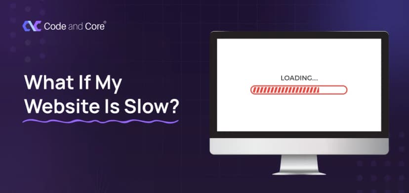
Technologies23.06.2026
What If My Website Is Slow


Looking for reliable white label services?
At Code and Core, your data is safe with top-tier encryption. For extra peace of mind, we're happy to sign an NDA to ensure full confidentiality
Hire Us
Let's Talk
Let's Talk
- Pay roll Basis
- Hire Tech Pool
- Maintenance of Existing Project
- Fixed Price Project
- Hourly Based
- Something Else


